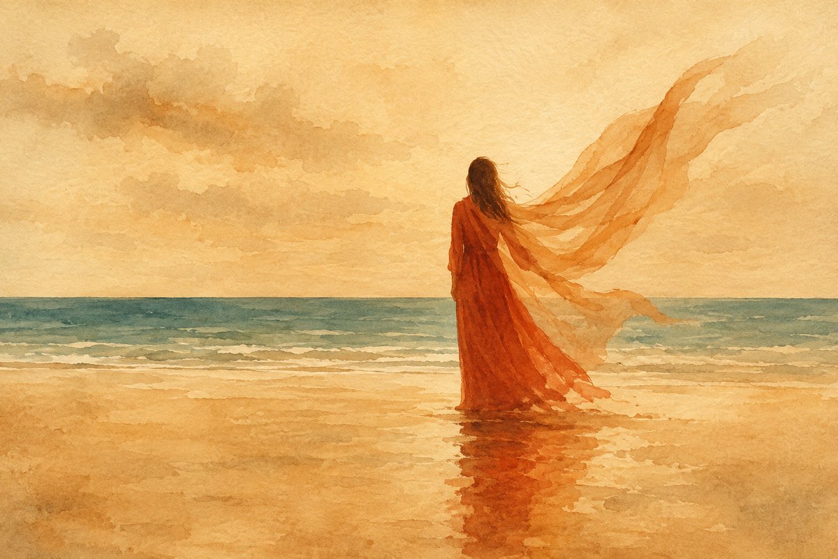
A couple books a sunset shoot by the sea. She picks a turquoise dress — her favourite, to fit the “sea theme.” At the golden hour by the water, the turquoise and the sea turn out to be the same colour, and in the frames she half-dissolves into the background: the eye loses her figure and latches onto her partner’s white shirt beside her. The dress is beautiful. In this frame, it works against her.
Clothing on a shoot acts as a compositional element on a par with light and background. Behind its effect lies not taste but a working theory of perception — visual weight in Arnheim, colour in Itten, the physiology of vision; below, it comes without the lectures, straight to the choice of dress and colour. Clothing decides two things: what mass a person occupies in the frame, and how they separate from what’s behind them. The first is silhouette, the second is colour.
Silhouette: what mass you occupy in the frame
The eye reads clothing as a shape, and a shape has weight — literally, the way Rudolf Arnheim described it in his analysis of visual perception. A compact, symmetrical mass gathered around its centre reads as heavier; an elongated, dispersed one reads lighter. The clothing tricks that slim a figure are built on this.
A long line. A long dress stretches the figure into the vertical and removes the horizontal breaks in the silhouette. On a shoot, long trailing fabric strengthens it — a veil, a length of cloth, a train. Here Kandinsky comes in: a line in the frame carries direction and movement, and flowing fabric builds the vertical and the dynamic that a static pose lacks.
A fuller figure. This is where the long line works hardest. Rubenesque forms are best shot in a full-length dress, and the longer the wrap or veil, the better: long flowing fabric breaks up the body’s volume and pulls attention onto itself. A short, tight silhouette does the opposite.
Colour against the background
Clothing colour is always read against what’s behind it. And here one decision comes first, with the rest depending on it: is the background a source of light, or just a backdrop?
Background as light. Sunset and a lit temple give not a coloured backdrop but coloured light — different physics, the additive mixing of light against the subtractive mixing of dyed cloth. The warm tone pours over the person and stands across the whole frame at once. You can’t argue with it in editing: white balance corrects along only two axes, and if you dress cool against warm light, blues and cyans go to mud, and pulling them back means breaking the whole warm frame. So under sunset and temple lighting (the Sanctuary of Truth, for instance) you dress to the light, in warm tones: black, white, red, and yellow hold; blue, cyan, and green don’t.
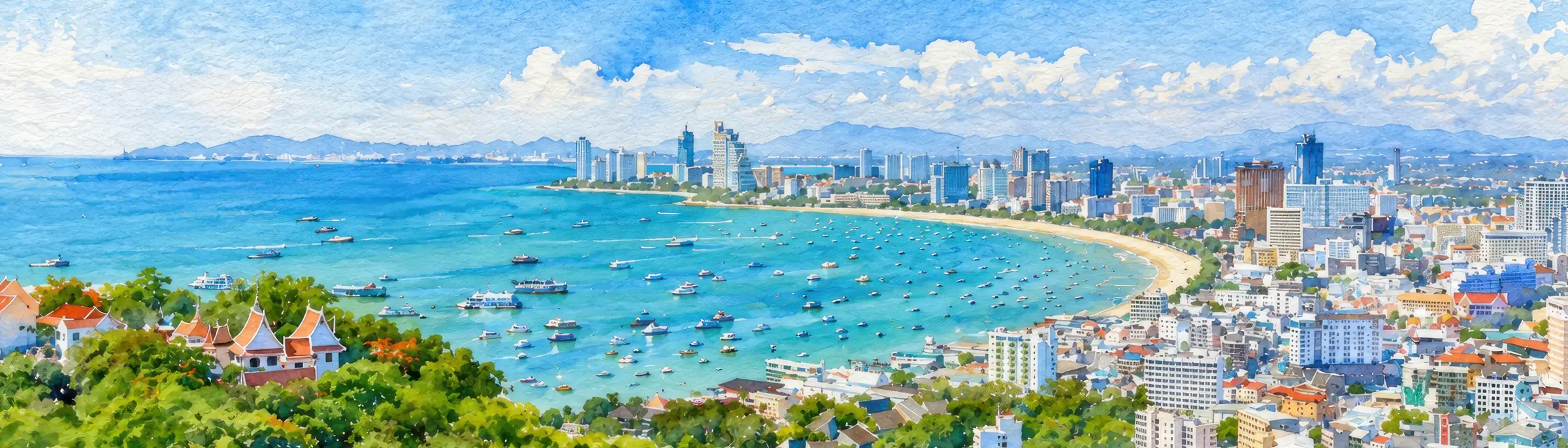
Background as backdrop. Sky, sea, and greenery under neutral daylight don’t pour colour onto the person — they just stand behind them. The task is the reverse: to separate the figure from the background by contrast. What contrasts with what depends on the colour of the backdrop. What follows are working rules for local shoots, drawn from the field; on Pattaya backgrounds they hold steadily.
Overcast sky and a washed-out sea — a white background. When the sky is overcast and the sea has faded to a pale whitish, the background works almost like a sheet of paper. Black and saturated pure colours hold on it — red, green, blue. Yellow and any pale shades sink: they’re light themselves and merge with the whitish backdrop.
Sunny sky and sea — a blue background. On a clear day the sky and water give a deep blue backdrop. Black, white, red, and yellow come out best — warm separates from the cold background sharply and cleanly. Green and violet get stuck: they’re neighbours of blue and merge with it. A large hotel pool behaves like the sea in colour — the same rules apply.
Greenery — open air and large green areas. Against foliage, white, red, and light blue win: red gives a direct contrast to green, white and light blue separate cleanly. Black falls into the shadow of the bushes, yellow and lime green merge with the foliage, deep blue and violet get stuck. A large landscaped hotel area is, in colour, the same as open greenery.
Temple and sunset — an orange background. This is the “background as light” case again: dress warm (black, white, red, yellow), while blue, cyan, and green fall away. By the colour wheel, blue is the opposite of orange and “should” stand out, but against warm light it stops contrasting and simply sinks, and editing won’t fix it.
And over all of this — the palette. A limited palette is the basis of colour composition in Itten: a frame reads when the colours are few — two or three coordinated tones across person and background together. The eye won’t gather more than four bright spots in a single glance — fast perception holds about four signals at once, and everything beyond that scatters the frame, however good each colour is on its own. Large prints and logos belong here too: a high-frequency texture that fights the face for attention and on a photo often looks cheaper than it does in life. One accent works; a motley scatter works against the frame.
Evening and night: where the red goes
Towards evening another mechanism switches on, this time at the level of physiology. In the dark the eye shifts to rod-based, twilight vision — this is the Purkinje effect: sensitivity moves towards the blue-green part of the spectrum, blues and greens brighten, and red fades first and sinks into the dark. So a deep red, wine, or burgundy will settle into a featureless black sack in the evening, while turquoise and cool white hold their lightness longest. For frames in neon and city lights this is doubly true: warm artificial light and twilight vision together crush the red, and betting on blue-green is the safer call.
Brightness and the “expensive” frame
A separate note on saturation. Bright clothing reads as “more expensive” and richer in a holiday frame, and the roots of this run old: in antiquity, colour was tied to means — the wealthier the state, the more vividly it painted its statues and buildings, and the link between saturated colour and luxury has stayed in perception. In our experience, for a holiday frame in Pattaya this holds: a saturated dress looks more festive than a washed-out one. In the local heat, wedding dresses cut in the style of Greek tunics sit best — light flowing fabric and a long line at once.
A couple and a family: one language of clothing
Clothing should tie a couple together, and dressing as a pair is worth doing whenever possible. One style for the two, or at least clear echoes — a shared tone, a repeated colour, a coordinated texture. If he’s in a business suit and she’s in a beach sundress, the frame falls apart into two random people side by side. One shared thread is enough — the colour of a scarf picked up from her dress — for the couple to read as a couple.
A family is the same rule. A whole family in matching outfits looks very good (a whole wedding in matching outfits, even better): the group reads at once as a single whole. A family usually has no matching clothes, so at least they coordinate the palette — three or four close tones with clear echoes. If one person wears a print, the others go plain, otherwise the patterns fight each other and pull attention off the faces.
How many looks to bring
One or two is enough. More just gets in the way: changing outfits steals shooting time and knocks the mood off. A partial change works harder — swap the top (men often just change a t-shirt on the move) and layer a new mini-location onto it, a different backdrop, or a change of focal length from the photographer. The result is an almost new look without a full change. A couple of considered outfits plus a few accessories usually cover the whole shoot.
Practical notes before the shoot
The place dictates both the fabric and the small things that break a frame unnoticed.
Fabric for the heat. At 32–35°C dense synthetics darken with sweat within 20 minutes and cling to the body. Linen, cotton, and light flowing fabrics hold both the person and the frame; the Greek tunic was invented for exactly this climate.
Showing through. White and thin fabric should be tested in advance — both in bright daylight and wet: everything gets wet by the water, even standing right at the edge, and wet light fabric turns transparent. Under white and light clothing, wear white underwear or underwear matched to the outfit — coloured shows through wet fabric.
Pockets. Empty. A common failure for men in white — cigarettes in the pocket leak in the heat, and a large dark-orange stain seeps through the fabric, one that on top of everything barely washes out.
Head. In bright sun a peaked cap helps — a cap or a sun hat: the face goes into shade, and in the frame the headwear works as an accessory to play with.
A shawl. In a temple, shoulders and knees are covered — a shawl or sarong takes care of that and at the same time works in the frame as a prop to play off later.
Footwear. On sand, footwear is almost unnecessary — barefoot is cleaner in silhouette and more honest to the scene. The exception is coastal rocks and stones: there footwear works both for footing and in the frame.
Hair. Don’t bet on styling: by the sea no product holds it, and around Pattaya itself the humidity kills a hairstyle fast. Natural waves, gathered hair, a low bun — these are more reliable. The only exception is a shoot indoors with air conditioning.