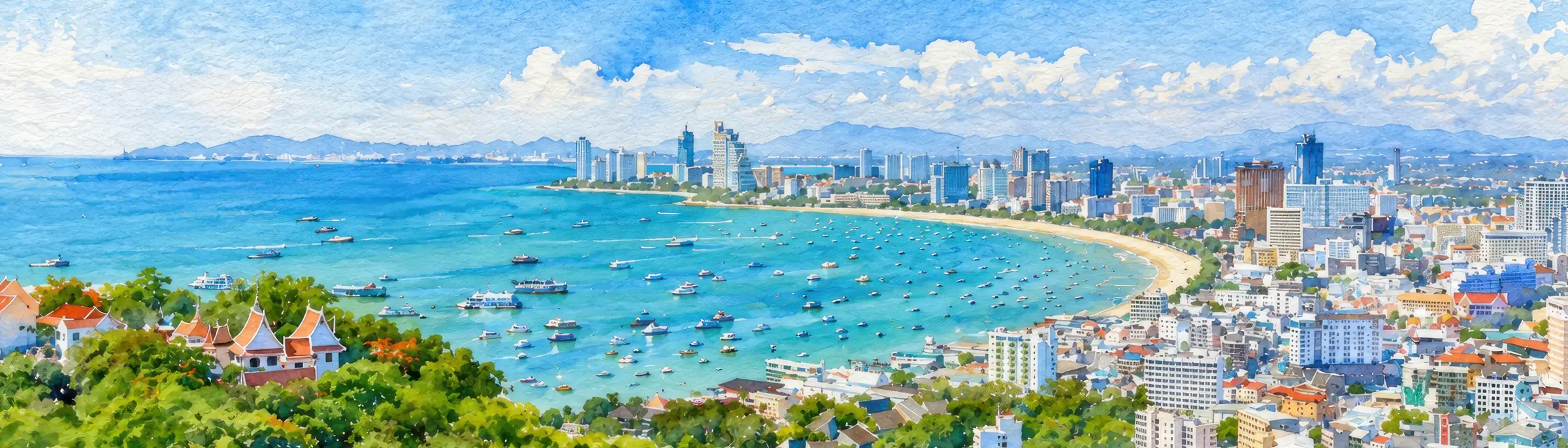
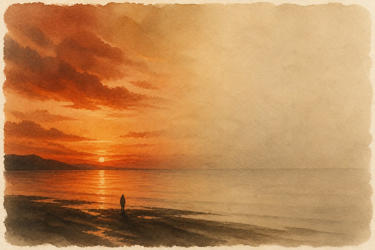
You’re handed a gallery of two hundred photos, all in the same honeyed tone. On a phone it reads as “stylish”: a couple against the sunset, warm, atmospheric. You scroll through and come away pleased. Then you open the same photos on a good monitor, and it all falls apart. The handwork on the bride’s dress is gone: where there was lace, there is now a smooth white patch. The groom’s black patent shoes have merged into solid black without a single highlight. And the vivid sunset the whole shoot was planned around has flattened into an even yellow-orange wash, identical from one photo to the next. By then the photographer has long since been paid and is shooting the next couple.
This article is about how to read a portfolio photo when you’re choosing a photographer, and how to tell style from a cover for a weakness the photographer couldn’t fix on the shoot itself or in the editing afterward. It is a tool for the client, not an exercise in naming names.
Almost every “signature technique” from the lower end of the market has a direct ancestor in the history of art, and that ancestor is what gives it away. The difference is in why the technique was chosen, not in the technique itself. A master made a similar move deliberately, knowing what it cost and what it forced him to give up in the frame. A weak photographer reaches for what looks like the same technique for a different reason: the honest alternative takes a skill he doesn’t have, while the technique lets him do without that skill and pass the result off as style. One such photo proves nothing on its own, since a technique used in moderation and in the right place can be entirely deliberate. What gives the game away is not the technique but its insistent repetition: the same move comes back in photo after photo, each time landing exactly where a hard technical problem had to be solved, and nothing in the rest of the work justifies it. We’ll go through the editing techniques first, the ones applied on top of a finished shot, and then look at where a mistake in the shooting itself is dressed up as style.
The single-tone wash
Let’s start with the most common one, which is also the easiest to fix. In his Theory of Colours, Goethe described a fault he called the false tone: all the colors of a picture are pushed toward a single hue, as though you were looking at the scene through yellow glass. He wrote that the device is born of bewilderment rather than intent, of not knowing what to do with color in the first place. Instead of wholeness, where every shade has its own place, you get uniformity, where a single tone is pulled over everything. Goethe was speaking of painters (photography didn’t exist yet), but the principle fits modern assembly-line editing exactly. A filmic lean toward sepia, one warm tint across two hundred photos, the fashionable teal in the shadows against warm skin: all of it is sold today as a signature style.
The economics behind the technique are simple. Honest color work is slow: white balance is set for the specific scene, warm and cool are separated within a single image, and skin is pulled away from the background. A serious set of photos takes hours. One ready-made preset washed over the whole gallery takes minutes. That is the lure: a signature style no longer has to be built up over years; you buy one once and then lay it over every shoot.
This technique also comes with a free tell: print. In color, a tone is always a shift along two scales at once, from the pure color toward white and from the pure color toward black. A screen keeps both scales wide: the backlight stretches both the light end and the dark end, which is why, on screen, a gallery washed in a single tone looks three-dimensional and alive. Paper behaves differently. It sharply narrows the scale toward the reference white (some pure colors, by contrast, gain a little range), and in print the same wash shows itself for what it always was: a flat, single-tone patch. What read on screen as a photographer’s own color work settles on paper into an even coat of ink with no depth. This tell comes in handy when you have a big job ahead that will end up as prints or go to press: a photo book, a print run, printed layouts. In that case, ask to see a printed photo from an earlier series rather than a phone screen. A photographer who really worked on the color will show you a print without hesitation; with one who applied a ready-made preset, print gives it all away at once.
A heavy outline instead of drawing
Goethe’s “uniformity in place of wholeness” has a close relative, in line rather than in color. For almost a century the Renaissance argued over what a picture actually rests on: the Florentines, led by Michelangelo, held to disegno (drawing, line, construction); the Venetians, led by Titian, to colore, color.
Once again the temptation is to get around the slow work on color, only this time by a different route: rather than wash the picture in a single tone, you do the opposite and cut the saturation hard, draining the color almost completely, and the long fuss over color seems to fall away on its own.
But the color in the picture was doing a job that can’t simply be dropped. The eye reads an image through contrast, and contrast comes in several kinds (form, size, light, color, meaning), any of which will serve. Draining the color switches off one of them, color contrast, and there is nothing left to hold the picture together: color was the one it rested on. Handling color at a basic level is a natural skill that develops on its own from childhood, while the other kinds of contrast take conscious effort and deliberate training.
The lost contrast has to be made up some other way, and the easiest is form: overall contrast is raised and the sharpening is pushed. This is over-sharpening, and the heavy outline is what it leaves behind. That outline imitates the outward mark of disegno, the line, and carries none of its substance: it copies the sign of mastery without the mastery. Hence the persistent pairing of “washed-out color plus a hard edge”: not an aesthetic choice but forced compensation, because once color contrast is removed, contrast of form takes its place.
So a photographer like this falls outside both Renaissance camps at once. He is no colorist, since there is essentially no color in his pictures. And he is no draftsman, because there is no form either, only an outline traced along the edge, whereas real disegno begins with conception and anatomy, not with tracing.
Darkening for false drama
Another way to give a weak shot some weight is to take it down into darkness. The picture isn’t expressive enough, so it is darkened “for drama”: the shadows drop to solid black, and everything light disappears from the frame. On a small phone screen it still passes for mood, but on a large one you see at once that there is no drama in it, just a dark, empty picture.
That’s because the real drama of chiaroscuro rests on contrast, not on darkness. In Rembrandt the shadows are deep but not empty: form survives in them, the face is modeled by a single light source, and the whole force of the picture lies in the drop from that light to a living, still readable shadow. Darkening everything at once is not the same thing at all. When the shadows are taken down to black and only dark gray highlights stand against them, there is no drop: the eye has nothing to hold on to, and instead of drama you get an even gloom. Drama is made by light next to dark, not by dark in place of light.
Here, too, you check with a cool eye: mentally strip the “atmosphere” off the picture. If strong light and readable form remain underneath, the drama is real; if what’s there is an evenly darkened picture with nothing holding it up, then all the drama was in the editing, not in the shot.
Retouching until the likeness is gone
The last of the editing techniques is the subtlest and has the oldest pedigree. Back in the fourth century BC, in the “Republic,” Plato called visual art three times removed from the truth: by his account, it imitates the way a thing looks rather than the thing itself, appearance rather than reality. Heavy retouching, taken to the point where the likeness is lost, is just that — Plato’s reproach, come true twenty-four centuries later.
This technique isn’t tied to the bottom of the market; the premium end uses it too, only more subtly. Our article on why the cheapest photographer ends up costing more already named heavy post-processing as one of the premium end’s masks: retouching that stands in for a moment and an emotion caught on the shoot itself. Here the same technique is in plain view: the skin is smoothed to plastic, the features are tightened, and the person in the delivered file is no longer quite the one who stood in front of the camera.
And the likeness is not all that is lost. Everything gets smoothed indiscriminately, and with the skin go the expression lines, which carry everything that is alive in a face: the smile, the squint, the emotion itself. So heavy retouching does more than hide a failure to catch emotion: it erases even the emotion that was caught by accident, and turns even a lucky shot full of life into a smooth mask.
You check this the same way as everything else, by calmly asking to see a few close-ups without heavy editing. Where retouching covers for a photographer who can’t set up the light or catch the life in a face, the gap between “before” and “after” will be suspiciously wide.
Editing in place of vision
All four editing techniques share one root: the photo is reworked so that it seems to have been shot with more skill than it was. But it would be a mistake to blame the editing itself, and it is an easy mistake to make. More than a century ago the Pictorialists deliberately softened their pictures so that a photograph would resemble a painting and set the artist-photographer apart from the mass of amateurs with their plain, sharp snapshots; in the nineteen-thirties Group f/64 answered them with its sharp “straight photography.” From the outside the argument looks like “to edit or not to edit,” but that is a trick of the eye. Ansel Adams, one of the central figures of that same “straight” school, worked his prints harder than almost any Pictorialist: his Zone System was tonal work planned in advance, and he made the sky in “Moonrise” darker with each successive print. So it was never a question of the editing as such, but of what it is used for. Adams pulled the print toward an image that had formed in his head before he ever released the shutter. A weak photographer has nothing to pull toward: he saw nothing in advance, and here the editing doesn’t develop an idea but invents one after the fact, in the hope that a smooth surface will pass for a photo with life in it. That is why heavy editing in itself points neither to an artist nor to a hack: what decides it is whether there is a photo behind it that the photographer really saw and caught.
These techniques do have one mitigating factor, though: they live in the editing, on top of a finished shot. However weak the result, the shot underneath is intact. It is the presentation that’s spoiled, not the shooting, and the presentation can be redone if you want. The last two techniques are a different breed. They are no longer editing but an outright fault in the shooting itself, passed off as an artistic device. There is nothing to recover here: the loss happened in camera, before any editing at all.
The backlit silhouette
The first of them bears the name of a man few people remember. Étienne de Silhouette ran France’s finances for just eight months in 1759 and economized so ferociously that the phrase “à la Silhouette” passed into the French of the day, meaning “on the cheap.” Before photography came along, a profile cut from black paper was the cheapest way to record a person’s likeness, for those who couldn’t afford a portrait painted in oils. It was plain poverty, with nothing deeper behind it.
Today the backlit silhouette, a dark figure against the bright setting sun, is passed off in portfolios as an artistic choice. In many cases the reason behind that choice is thoroughly prosaic: the photographer doesn’t know how to set up fill flash against the backlight to lift the face out of the black, and quite often he simply has no flash at all. And since hardly any light reached the face, there is nothing to lift out of the dark figure: the loss is final, and it happens right there on the shoot. A technique whose name once meant “on the cheap” is presented as a signature style by someone who doesn’t know the etymology of his own signature.
One caveat here, so that two different silhouettes don’t get confused. In our article on choosing clothes for a shoot, the silhouette is the mass your figure carries in the picture, something you choose with your clothes before the shoot even begins — a tool in the hands of the person being photographed. Here we mean something else: a technique of framing and presentation that can be read only after the fact, from the finished photos, and that tells you about the photographer, not about you.
Overexposure
The second technique of the pair sits at the other end of the brightness scale, the light end. Like the rest, it has its stylistic excuse: overexposure is passed off as “light,” “airy,” delicate, as if the glowing, weightless picture had been meant that way. More often, though, what lies behind it is not intent but a failure to handle a bright scene. When the exposure is pushed too high, the brightest areas (the sky, the bride’s white dress, the highlights on the skin) blow out to pure white, and the pixels hit the ceiling, the maximum beyond which no values exist. No data is left in those places at all. Shadows can almost always be lifted, because something did get recorded in them — down at the noise floor, perhaps, but recorded. Overexposed detail can’t be brought back, because there was nothing to record. No amount of editing will retrieve what the sensor physically didn’t capture.
You can check this yourself, right on the photographer’s screen, even without a print. Zoom in close on the sky and the white dress. If you can see the folds of the fabric and soft tonal transitions in the clouds, the highlights have held and the information is there. If instead you find uniform, paper-white patches with no texture at all, the highlights are blown, and the shot was ruined in camera, before any editing and through no fault of the editing.
There is one caveat here, and a narrow one. A master sometimes sacrifices the highlights deliberately, for drama, so that the scene itself dazzles. In his late work Turner painted the sun as a blinding white void: in his “Regulus” the glare literally devours the whole scene, and it is the viewer who ends up blinded. But the difference is in control and in scale. A master allows a single loss, chosen and placed exactly where he wants it, while everything else in the picture is rendered flawlessly. Where the exposure simply wasn’t kept under control, the highlights are blown everywhere at once, through oversight rather than by design. The same test, in the client’s hands, tells the two apart: one deliberate sacrifice in an otherwise perfectly rendered picture is a technique, whereas uniform overexposure across the whole shot is just a botched job.
The references gathered here are not meant to catch a photographer out; they are there so that you can take a calm look at a photo for yourself and choose by what lies beneath the beautiful surface, not by the surface. And not every photo has a trick behind it: sometimes a cigar is just a cigar.